
Mobile Website Optimization Errors That Cost Publishers Traffic & Money

Get helpful updates in your inbox
Mobile Website Optimization Errors That Cost Publishers Traffic & Money
One of the biggest factors that lead to website optimization errors is that publishers are often publishing their content from laptop and desktop computers. Why is this a problem? Because the majority of internet traffic is now mobile traffic. Mobile website optimization is easily overlooked, and this means that publishers often miss big SEO and revenue opportunities.
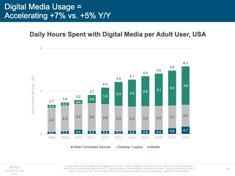
Mary Meeker’s 2019 trends report highlights the increasing levels of time spent consuming digital media over the past decade across device types. Since 2014, media consumption has become a landscape that is mobile dominant, with the percentage of laptop and desktop use slowly shrinking.
This data is important because it’s a blind spot for publishers. The majority of their time is spent writing, publishing, and viewing their content from a laptop or desktop computer. Subsequently, they don’t look at the mobile versions of their websites frequently enough, if at all.
Below, I will take you through mobile website optimization errors that cost publishers traffic and money.
What are common mobile website errors?
The first common mobile website error is that images or other aspects of the page content aren’t sized correctly. You might be forced to scroll left to right because there’s an image on the page that wasn’t optimized for mobile.
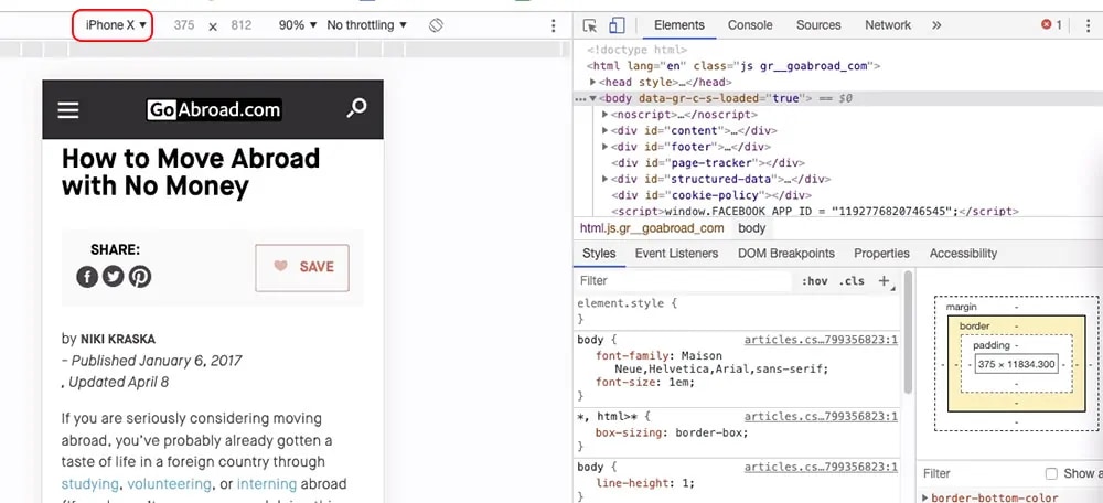
Here is an example of a website whose content isn’t optimized for mobile. On an iPhone X, a user would have to scroll to the right to subscribe to this site’s newsletter because the content is cut off. This type of optimization error will negatively impact the browsing habits for users. And, with Googlebot now rendering mobile pages in the latest version of Chrome, Google will notice that the content is not easily readable for mobile visitors on this page.

The second common mobile website error is the location of ads. Many times, publishers have ad locations set but don’t think about how those locations will appear on mobile
For Example: A lot of times in the mobile layout, the sidebar goes to the bottom of the page. In this case, most people won’t scroll below your content on a mobile device. If you put the majority of your ads in the sidebar, it is likely these aren’t viewable and aren’t being engaged with. This can affect ad rates over time. If you’re using a tool like Ezoic, this limits testing options as well (which could also impact revenue).
So, if the only place you’re putting ads in non-mobile-friendly locations, advertisers might ultimately blacklist you or bid lower—all of which aren’t good things for publishers. For these reasons, you want to ensure you have both content and ads that are mobile-friendly.
What is the inverted pyramid method of content writing?
The inverted pyramid style of writing originated from journalism. It stipulates the most essential information comes first, often called the ‘lead’ or ‘hook’. Second is the additional information that’s important to the reader. Lastly, is other general information and background information.
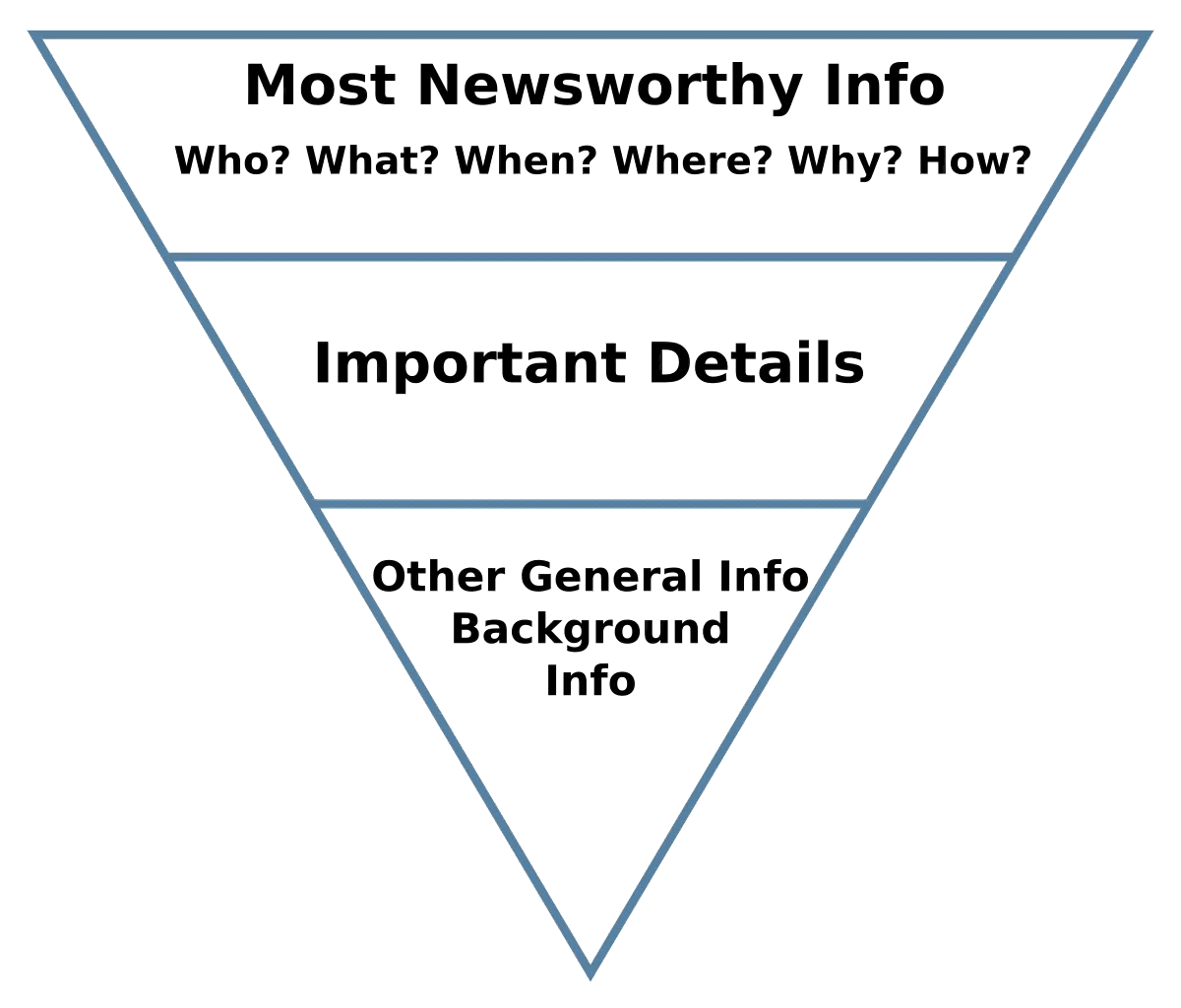
The inverted pyramid style of writing also applies to content writing and how Googlebot might crawl your site on the web. This style of writing can be important to improving SEO because it gives Google — and readers — the most important information they are looking for first.
If a user clicks on your content from the SERP (Search Engine Results Page) and doesn’t bounce, your site will likely rank better over time compared to one where the essential information is at the bottom of the article and the visitor returns to the SERP to find another website with the information they were looking for.
IMPORTANT: If publishers have organic search coming to their site, many think the best way to get people to read the whole article is to put all the important information at the bottom. The issue with this philosophy is that with mobile search queries, if people aren’t getting the specific answers to their questions on mobile, they are jumping back to the SERP.
When Google sees a bounce back to the SERP, and someone goes to another site, it’s commonly thought of as one of the worst signals you can have in terms of search engine rankings because Google reads this as, “This content wasn’t answering the question, but this other content was.”
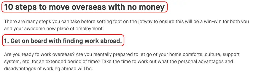
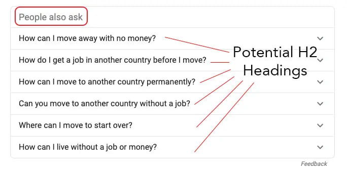
EXAMPLE: Here is the top result for the Google search “How to move abroad with no money.”

Google has created a rich snippet from this 2017 article on how to move overseas with no money. One thing a publisher can do to optimize content for mobile and for rich snippets is answering key questions at the start of an article. We have a great guide on how to do this with H2 headings here.
This way, Google knows your content is answering the questions within a user’s search query immediately. Additionally, visitors truly seeking answers to a search will be satisfied with the publisher’s answer and won’t return to the search page for a different result.
This is why the inverted pyramid method of writing is a fundamental SEO tool that all publishers should consider applying to some of their articles. GoAbroad.com’s article follows this style of writing, and after a short introduction, they move into answering the questions their content provides the answers to.
Leading with the H2 heading, they directly answer the 10 questions Google inserted into a rich snippet that appears as the top result for the query. If you want to improve SEO and visitor engagement, our Content Writing Guide is a great place to start.
Also, for publishers who want to leverage their content to produce rich snippets for Google, creating structured data markup can help. Google often pulls some of this information to provide searchers with immediate query answers, leading to immediate #1 ranking results for the URL with the structured data (often called, Position Zero).
How should publishers optimize for mobile devices?
- Regularly browse your site on a mobile device. Utilize the inspect element feature in Chrome to see what mobile users see. With Google Analytics, you are able to see which devices are most frequented on your site. This will guide you to which device you should be checking your content on.
- Don’t have your ads or ad placeholders in areas that are not common for people to see on mobile. Ensure the ads are not bunched up in one area.
- Use the inverted pyramid style of writing, and make sure to answer the essential questions your content is going to cover at the beginning of your content.
Always use the inspect tool on your browser to ensure your images, ads, and content are sized properly for mobile. Viewing your site across different devices is a crucial step to ensure you avoid website optimization errors that cost you time and money.
How should sites structure long-form or informational content?
This blog post is a great example of how long-form or informational content should be structured to optimize for various search queries. The essential answers are given first. Then, you can dive into the additional details, and at the end, cover any background or ancillary information.
IMPORTANT: The worst outcome is for the person who came to your site returning to the SERP because they don’t think you’re getting to the point fast enough. When planning how to optimize your content, refer to the “People also ask” section on the first page of Google’s search results. These serve as excellent indicators of the kinds of questions people are searching for on Google that are related to particular keywords or topics you are optimizing for. They can provide insights into the types of H2 headings and information you can use to structure your content more effectively.
 Will optimizing mobile content help with SEO?
Yes, big time. Statistically, the vast majority of traffic to your site is on mobile, and since March of 2018, Google now uses mobile-first indexing. When Googlebot crawls a site, it doesn’t crawl the desktop version or a mix of both—it crawls the mobile version. So, that is what Googlebot is seeing now too.
If you want to learn more about how to take advantage of Google’s mobile-first index, we wrote a blog on that. The checklist for ensuring your content is optimized for mobile is:
- Your menu and navigation are mobile-friendly
- There’s no content overrunning
- No ads taking up a majority of the viewport in one location
- Images are sized properly for mobile or open in a new tab when clicked
- No overly lengthy, long blocks of text
When Googlebot is crawling, this is exactly what it’s seeing. Not only that, but that’s what your visitors are seeing as well. Improve your visitors’ experiences by providing a website experience that’s crawlable to Google, and present your content in a well-structured manner. These tips will help your site more effectively than the majority of SEO advice online.
What is the best way to present images on mobile?
The best way to present images on mobile is to make sure they look good/viewable on mobile devices.
You may have a sophisticated chart that looks great on desktop, but on a mobile device, you can’t click on the image and enlarge it. We have all been there before—using your thumbs to keep spreading the image out to see the content it contains. If this is the case, ideally you want to create a version of the image that’s better for mobile, or you can make the image open in a new tab when it’s clicked on.
Should websites change fonts or heading sizes for content on mobile?
In a lot of cases, websites should change fonts and heading sizes. Whether you’re using WordPress, another CMS, or custom coding, you can set your font and heading sizes differently for mobile. Sometimes publishers choose a font that’s great on desktop, but on mobile, it’s difficult to read, or the spacing is tight.
Some publishers will disregard this advice because it’s “just on mobile.” You want to ensure your font is spaced correctly, and it’s large enough to read and enjoy the content. Also, good spacing will help people scroll. Google is also measuring dwell time and engagement time. It’s important to give people readable content that they scroll through. Below is a website whose fonts and headings are not optimized for mobile.

EXAMPLE: Using the inspect element tool on Chrome, I’m viewing this site from an iPhone X. The viewport shows that its landing page is not optimized for mobile. While the menu font is just barely readable, it would be difficult to click the menu links without hitting the incorrect link accidentally, due to poor spacing. The quotes linked to the right of the image are so small they are entirely unreadable. This site is a great example of why your content should be optimized for mobile; if a user searches for Mark Twain quotes, lands on a site with a non-existent mobile layout, and then returns to the SERP, Google’s crawler will see users bouncing and your search rankings will suffer.
What else is important for publishers who are optimizing a mobile site?
How can you increase the speed of a site on mobile devices?
- CSS and JavaScript optimization
- Lazy loading images and serving Next-Gen images
- Pre-connecting origins: This caches all the potential third-party calls that a visitor would need to do when they hit a page. Pre-connecting those calls save visitors a jump in terms of page load and site speed. We have an upcoming blog on how to do this coming out soon.
- Ensuring an active CDN
How do publishers improve mobile content?
The biggest way to improve mobile content is to think about it the same way a user experiences it. Look at your content on a mobile device. When structuring content, think about the process from the perspective of if you were searching for an answer to a question or trying to find content through a search engine.
Ask yourself, “If I were to land on this page, is the information I want to see going to be here immediately?” If the answer to that question is no, it’s a good idea to start making these changes across your site.
Here is a short summary of the steps to optimize for mobile:
- Write adhering to the inverted pyramid method
- Break up your content with H2 headings and answer essential search questions immediately
- Use the inspect element tool to view the mobile version of your site
- Ensure images are sized properly or open in new window
- Choose fonts that are readable and properly spaced for scrolling to increase dwell time
Remember: Googlebot crawls your site through a mobile lens, the majority of web traffic stems from mobile, and answering questions immediately with the most essential information are all fundamental practices to abide by in order to avoid the mobile website optimization errors that will cost you traffic and money. If you follow these steps, you are going to be light years ahead of publishers who choose to turn a blind eye to the mobile versions of their site.
If you have any questions or comments, leave them below and I’ll try to answer.
Allen is a published author and accomplished digital marketer. The author of two separate novels, Allen is a developing marketer with a deep understanding of the online publishing landscape. Allen currently serves as Ezoic's head of content and works directly with publishers and industry partners to bring emerging news and stories to Ezoic publishers.
Featured Content
Checkout this popular and trending content

Ranking In Universal Search Results: Video Is The Secret
See how Flickify can become the ultimate SEO hack for sites missing out on rankings because of a lack of video.
Announcement

Ezoic Edge: The Fastest Way To Load Pages. Period.
Ezoic announces an industry-first edge content delivery network for websites and creators; bringing the fastest pages on the web to Ezoic publishers.
Launch

Ezoic Unveils New Enterprise Program: Empowering Creators to Scale and Succeed
Ezoic recently announced a higher level designed for publishers that have reached that ultimate stage of growth. See what it means for Ezoic users.
Announcement
