3 Website Redesign Tips That Will Triumph In 2018
As someone who has been building, managing, and growing websites for more than a decade, there are few things that scare me more than a website redesign. Nothing has the ability to cause more headaches and ruin more hard work than unnecessarily messing up a healthy web property.

Yet… the web was built on content creators and media publishers changing and improving the way they deliver content to readers. This is the reason why we read content off of phones now instead of newspapers. So, what website redesign tips can we use to mitigate an all-out disaster?
Below, I’ll share a few hacks, tips, and strategies that will work really well heading into 2018. We’ll look at some of what the latest data is telling us about visitor behavior and how we can use that information to make our web properties better places to browse.
Why website redesigns are often a disaster
There are few projects that start off with better intentions than redesigning a web property. Publishers often consider building new layouts, trying out new navigation, or even implementing a whole new CMS. Having undertaken dozens of these projects, my advice is almost always the same, DON’T DO IT!

Just kidding, well, kind of. I’ve shared this story before in my post about how to scientifically improve your website usability, but it’s worth reviewing again. I was hired 3-4 years ago to help a media company redesign one of their sites. I showed them some really cool hacks about how to nearly double their organic traffic without redesigning anything. It worked. However, they were convinced that redesigning their “ugly” site would further enhance these results. They were wrong.
That site saw a major loss of traffic and user experience metrics(bounce rate, session duration) after the new website was launched. All redirects etc. were performed correctly but it didn’t matter. Unfortunately, users universally hated the new experience; even though it looked nicer to the execs that selected it.
Ultimately, we rolled the site back to the original and traffic slowly recovered. It was all a huge waste of money.
Website redesign failures have 3 things in common
Fortunately, there are three things that are at the heart of every website redesign failure that you can avoid. If you’re aware of them, you can use the rest of the tips I list below to implement a really successful project.

1.) Personal aesthetics trump data
This is definitely number one. All failed redesigns I’ve come across almost always start with…
“Our site looks outdated”
“The website is ugly”
“We want it to look more modern”
These are brand-facing sentiments that originate from wanting to get visitors to perceive the brand of the web property differently. There is nothing wrong with this, but if this is the entire premise of the redesign, you may be in for some tough sledding.
This can be important for some sites; however, it is often heavily driven by personal bias. Most brand considerations can be easily accounted for without any sort of major redesign (i.e. colors, logos, fonts, etc.).
When a website redesign is driven by these ideas the visitor is almost always left out of the equation. This can even happen when doing something as simple as changing a WordPress theme to improve experiences. In the project I mentioned above, the executive team swore that the new site design they had picked was driven by a heat map test they ran on their original site.
Unfortunately, heats maps are a lot like ink blot tests. The data isn’t really objective, and we are left to insert our own personal opinions around how these should be acted upon.
If you really want to insert data into the equation, you should start considering the objective data commonly available to website publishers.
2.) Implementations happen without any testing
This ties nicely with #1. It is really hard to have any sort of objective data that can lead to a successful website redesign without testing. In fact, The Economist has been redesigning their site slowly with tests for over a year.

This actually isn’t the best idea either, but at least they are inserting some caution into major changes that will affect their visitor’s experience and revenue. This is something we’ve been talking about for a long time. User experiences and digital revenue are closely tied.
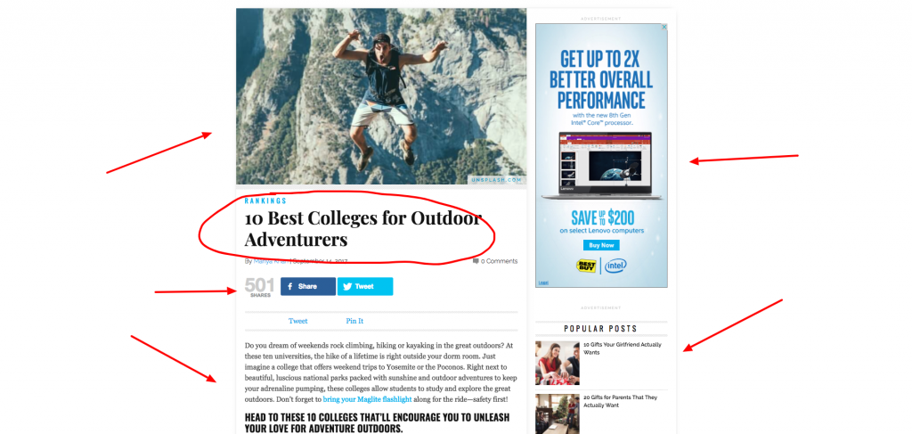
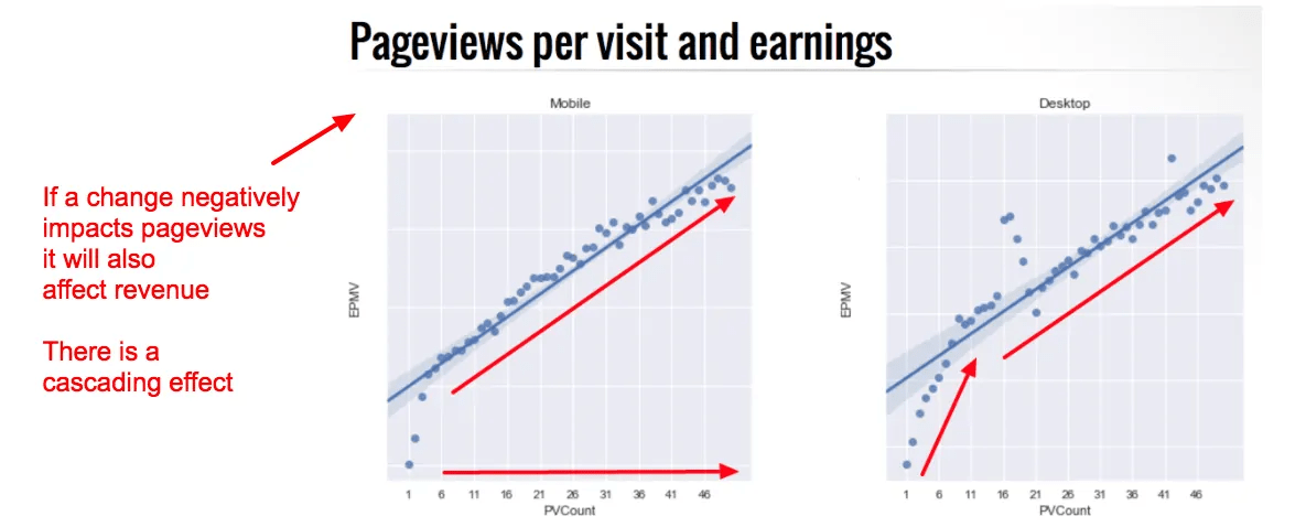
All the research we’ve done on thousands of sites over the years have shown one thing really clearly. There are few things that affect visitor experience metrics and revenue more than altering things like layouts, navigation, ad positions, and backgrounds. If you make a change in one of these areas without data, you could create a very negative cascade of events.
And, without data (see #1) it is more likely than not that you will. However, A/B tests can also lead you down a slippery path if you’re not careful.
3.) Fundamentally critical considerations are an afterthought
Thinking of moving that old PHP website over to WordPress? I bet that will make it easier for writers, and could even make it easier to manage. Unfortunately, out of the box, WordPress is likely to run slower. What’s more, if you load it up with a bunch of plugins, it might be a lot slower.

Pagespeed, in general, is rarely tested (see #2) prior to a lot of redesigns, but it is one of many critical considerations that must be accounted for first. In fact, most publishers don’t even know how to properly measure pagespeed in a meaningful and impactful way!
This doesn’t mean you can’t make a major change like this. It just means that you need to account for everything in the process. Website speed and visitor engagement must be tested and accounted for from every angle before changes are made.
If a publisher doesn’t understand how something like engaged pageviews, DOM Interactive, or navigation bounces will be affected by their website changes, they run a major risk of harming ad revenue and SEO over time.
Website redesign best practices and new ideas
If you can mitigate the risks above and avoid these major pitfalls, we can look forward to some of these website redesign best practices. These are the things that data has shown to be effective across the thousands of sites that I have a chance to look at.

1.) Tailor layouts to every visitor
At Ezoic, we’ve been doing this for a half a decade, and the results are always the same. Websites that can tailor layouts around visitor experience metrics— like pageviews and bounce rates — see uplifts in organic traffic and digital revenue per session.
In fact, this insight was the inspiration for our CEO, Dwayne LaFleur, to start Ezoic. Once upon a time, prior to Ezoic, he created the very first ad network for Facebook. Dwayne noticed that all ad networks had the same problem. No matter what they did, they could never produce the kind of results that an app developer could accomplish simply by changing their layout.
That remains the case today with publisher sites. Layouts offer the biggest ROI of any change that can be made. However, all visitors are different. What works well for one visitor, might work terribly for another (we’ve proven this).
The best thing a publisher can do is test different layouts on different kinds of visitors. Then, deliver the right layouts to the right visitors; based on data.

2.) Start tracking engagement metrics by landing page
As I mentioned before, Engagement Analytics have helped us get a much better idea of how visitors actually behave. Understanding and improving how much time a visitor actually is spending engaged during a session, and on how many pages they are engaged more than 15 seconds, offers a pretty big financial upside.
One of the biggest ways to affect these metrics in a positive way is to reevaluate how you are actually publishing content. Design a content calendar and content strategy around the content that is producing the most engaging sessions and engaged pageviews per visit. These typically produce much higher session earnings (EPMV).
The best way to do this is to closely evaluate your top landing pages sorted by engaged pageviews, engaged pageviews per visit, and by EPMV. Seeing which pages overlap among the top in each category will offer some keen insights into what types of content are driving the best experiences and most revenue on your website.
Experiment with this knowledge by building out a content strategy that will take advantage of this info. Create a series of new content that is designed to be just like your best content. For example, put images in the same locations, include similar videos, keep paragraph lengths and styles in a consistent fashion.

When it’s all said and done, monitor that content to see if it performs like the other killer content. If it does, you’ve unlocked a powerful new formula for your content team.
3.) Explore new mobile technologies like PWAs

Pretty much every digital publisher is familiar with AMP. Additionally, most publishers are also aware that results with AMP are pretty mixed. PWAs (Progressive Web Apps) are a new mobile technology that the publishing industry is pretty Amped excited about.
Progressive Web Apps are a collection of design-based technologies that combine the functionality of apps with the normal functionality of a website.

Beneficial Functions:
- Pre-caching allows the web app to load instantly, eliminating dependence on networks (they even work when users are offline)
- Fast load time for scrolling
- Enables push notifications at the top of user devices
- PWAs are compatible with all devices
- Served HTTPS by default
- Allows users to download an app experience of their mobile web to the users homescreen for convenience
The speed and in-app-functionality enabled by PWAs initially seem to offer some pretty powerful benefits for publishers. Typically, delivering content faster and providing greater flexibility and functionality to users is a good thing. When harnessed with the information above, it should offer some pretty interesting results.
For publishers considering a website redesign of their desktop website, perhaps you should rethink that project in favor of a mobile PWA build. Most visitors are mobile now, and redesigns are ripe for error (see above). Adding a PWA for your mobile site may allow you to get ahead of the market in 2018.
Rethinking a website redesign project
I’ve talked a lot of publishers out of website redesigns over the years. Despite being risky, they are typically time intensive and expensive. Hopefully, some of the tips above can lead you in a more data-driven and beneficial direction.
If you’re already an Ezoic user, I wrote a blog a while back on 5 website projects you can do using the Ezoic app store. These are small projects but also worth looking into if you’re considering other new projects for 2018.
Questions, thoughts? Leave them below and I’ll chime in as always.


