Improving Ezoic Performance On Your Website
This is the third installment of Everything You Needed to Know about Ezoic Settings but Were Afraid to Ask, with apologies to Woody Allen, of course! In the last few weeks, Ezoic guru Piper Lofrano and I have talked about Accelerated Mobile Pages, ad blocking strategies, excluding pages from Ezoic, increasing revenue with Ad Mediation, Ad Tester and Layout Tester. If you haven’t read those, you really need to catch up: Tune Your Ezoic Settings Part 1 and Tune Your Ezoic Settings Part 2.
Part 1: Optimizing your Ezoic settings
Part 2: Tuning your Ezoic settings for success
Skip to Part 4 — Maximizing your time with Ezoic

Back? Caught up? Great. As discussed last week, there’s really no more important element to your Ezoic experience than understanding and properly configuring Layout Tester, but that doesn’t mean there aren’t other areas in the Ezoic settings that you should tune.
This week I want you to put on your mad scientist lab coat, shake out your hair so it’s all crazy, and practice yelling “It’s…It’s… It’s ALIVE!” because we’re going into the strange hall of mirrors that is Ezoic Experiments.
Running experiments with Ezoic
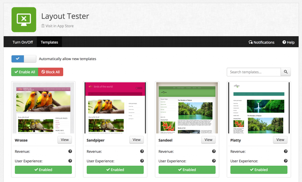
In essence, Experiments is where you can gain insight into what’s happening with Ezoic’s Layout Tester. It shows the various designs that you have run and are running with stats for how that particular layout is doing on a number of different dimensions.
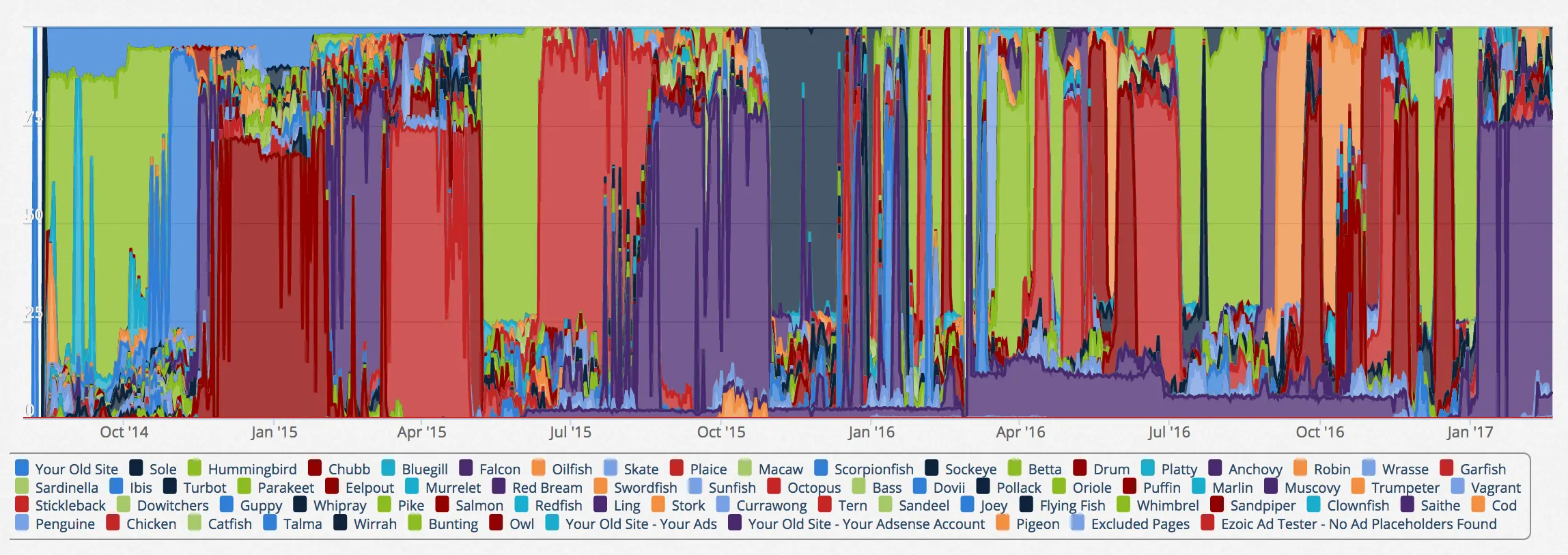
Launch Experiments and once it’s loaded the data – which can take a few seconds – you’ll see what looks like a child’s crayon drawing after a few days in the desert:

There’s actually a ton of data shown in this view because each color represents a different layout design, and it’s also given a name in the bottom legend of the graphic. Look closely and you’ll see that experiments win for a while, they are supplanted by another more winning layout. Right now, on my site, Vagrant (orange) is doing well, but even a few weeks ago it was the green Hummingbird layout that was maximizing time on page, pages per visitor and ad revenue.
The graph itself can be bewildering, which is why if you place the cursor on any point in the timeline, you’ll get a pop-up that shows exactly what layout is doing the best, as shown below:

Finding winning ad combinations
You can see that on June 3, 2015 Hummingbird was definitely winning and 74% of all pages served up by Ezoic were using that layout. Next most popular was Macaw, with 7.64% of visitors seeing that layout. The default layout, shown as “Your Old Site”, does so poorly by comparison that a bit less than 1% of visitors were seeing that particular layout.
Note: you can change your Layout Tester settings to specify what percentage should see your standard layout if you’d rather 50% of visitors got the usual site while the Ezoic experiments were running a bit more slowly. I personally love the mad scientist element of Experiments so let Ezoic go at it, but your preferences may vary!
One thing to keep in mind is that a layout that works really well today might actually not continue to be the winner a few months or longer down the road.
User behavior changes over time
Ezoic now has lots of data to demonstrate that there is no “best” layout because usage patterns and your audience evolve and change from day to day, week to week and even season to season. For example, a layout that works well for someone sneaking a peek of your NFL stats while at work might be very different to one that works best for that same person relaxing on a Sunday afternoon, online while they’re watching a game.
That’s also true across platforms, which is why Experiments break down by iOS App, Mobile, Tablet and Desktop:

That’s the basics of Experiments. If Layout Tester is the heart of Ezoic, then Experiments is the brain. We just hope that it’s not from the jar labeled Normal, Abby!
Next week, we’ll keep digging into Ezoic settings. Are these helping you so far?

