Today’s discussion is focused on creating a way to track Core Web Vitals. Specifically, the way Google does and how the results are instant.
We’ll be making a Chrome UX data dashboard. The goal is to monitor and see month over month how your Core Web Vitals are either improving or declining in granular detail. This process takes place inside Google’s free Data Studio.
If you’re not familiar, you can quickly search for it or it can be found here. Setting up an account is easy and free.
Connecting Core Web Vitals Field Data
First, select Create in the top left and then choose Data Source.
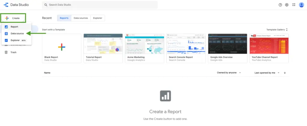
From here search for Chrome and select the Chrome UX Report. This is the connector that will show the honest field data (28-day average of our actual user Core Web Vitals). What has usually been difficult to find, is now readily available.
You can usually view lab data inside of Lighthouse but that is only telling you what your website is today, more or less in a Chrome browser “bubble”. The report we’re creating now is real-world user experience.
Once you select the report, enter your origin URL.
Make sure to use the actual origin URL. Then check the box that says “Allow ‘Enter origin URL’ to be modified in report”. This will make sure that you have the proper URL.

Hit connect and say allow.
If you see an error message, that’s fine, not a big deal at all just ignore it. If you don’t, great. We all like being error free.
Next, you’ll see a lot of fields. It may look confusing but don’t fret.
Go straight to Create Report in the top right.
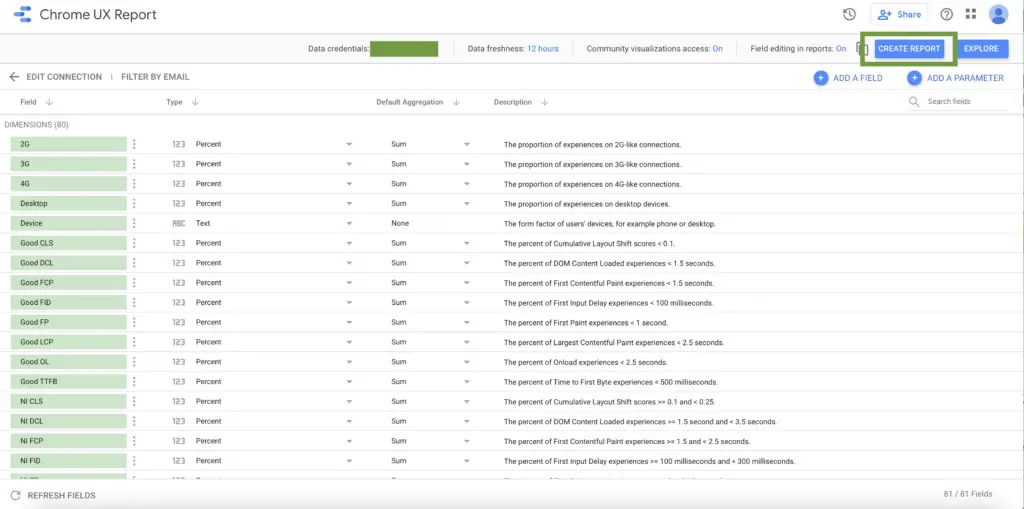
And ta-da! Here is your report.
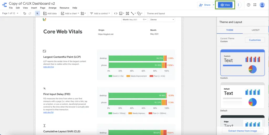
Looking at Chrome UX Data
Now you may be looking at some of the data wondering how to navigate this better and draw conclusions.
You can customize the report in this first pane but most people will likely just want to go to View (pictured above).
Once you’re in the View panel, now you can see the current Core Web Vitals for the existing month.
From the drop-down, you can see how far Chrome UX data goes back historically for the particular site.
For example, you could go to LCP and you can see how it has changed over the month. If you’ve been working to optimize and retool things on your site, you can see previous months all through your historical data.
You can select by device, exclude devices, etc.
In the case of this publisher, you can see that their CLS saw its worst performance in December of 2020. In May, the most recent month of data gathered, the site has the least “poor” and the most “good” CLS it’s had in history. That’s positively a metric to gloat about.
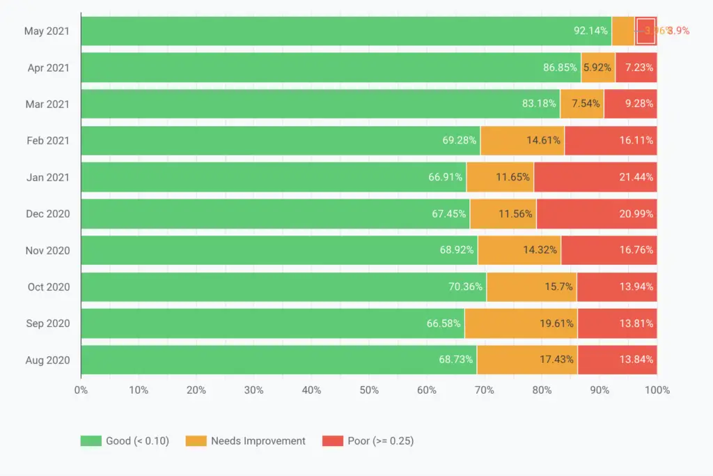
You can see that over time, this publisher has been improving the TTFB (Time to First Bite) as well.
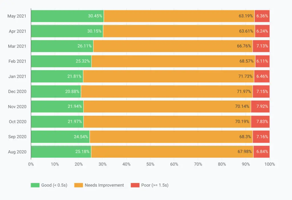
Same thing with DOM Content Loaded.
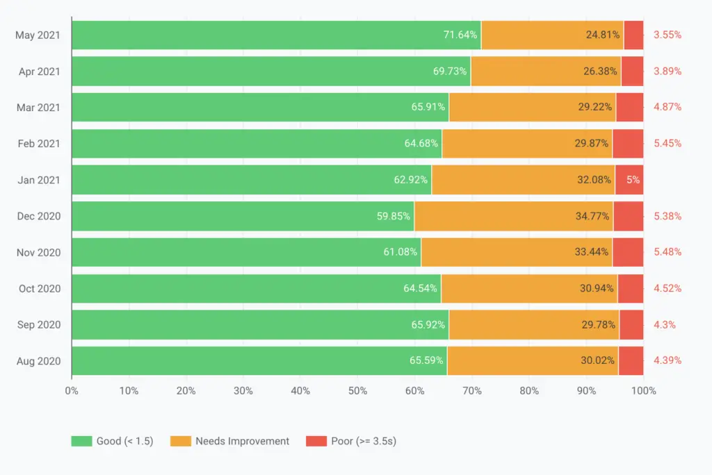
Here’s a helpful piece on all the key metrics you’re seeing in the report and what they mean.
Why this data matters most for SEO
Overall, this is a fantastic way to monitor your Core Web Vitals in the field and how they may shift over a period of time.
As aforementioned, this is previously something that was largely unavailable. It’s a more in-depth version of being able to see how your actual users are experiencing Core Web Vitals.
More importantly, the reporting uses the data that Google Search is planning on using in their page UX update. So it’s another way to be proactive in regards to future Google updates that could affect your search ranking/organic visibility.
It’s essential for our publishers to feel connected to their CWV scores and what that means to their sites, businesses, and even livelihood. User experience is more critical than you may think and it’s time to put in the work to improve it.
In other news, see How The Google Core Update in June 2021 Impacted Publishers.

