Tuning Your Ezoic Settings For Success Part 2
In my last post, I dove into the robust world of Ezoic site settings and preferences with the able assistance of Ezoic’s own Piper Lofrano. We covered the basics of the dashboard and why you really need to be paying attention to the settings, even though they can be a bit complex and, yeah, a bit daunting too. Specifically, we talked about AMP, Recommended Pages, AdColors, BlockAdPlace, Exclude Pages and Mediation. You did read that one, right? If not, go read it now. We’ll wait here.

Piper and I both want to emphasize that one of the most dangerous of the settings covered last week was how you have BlockAdPlaces configured. It makes sense if you think about it: tell Ezoic not to put ads in the key spots on your pages, and your impressions and clicks could plummet precipitously. That means lower revenue and a general lack of delight in the benefits that Ezoic can bring to your site.
This time, I want to jump right back in and start by looking at both AdTester and LayoutTester, both of which are critical to Ezoic’s AI being able to do its job optimally and maximize the results on your site for every single visitor, whether from mobile or desktop, domestic or foreign.
Go back to Part 1 or skip to part 3 or Part 4.
Using Ad Tester on your site
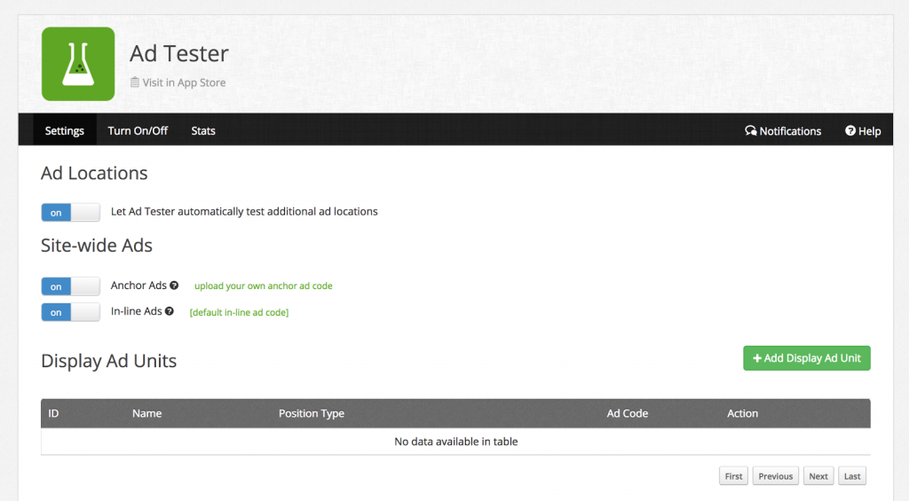
This tool lets you test new ad sizes, locations, density of ads, ads per page, ads per user session, etc. This doesn’t change the layout of the page, just what ads are placed in various places on the pages.
If you’re using Layout Tester — which you should — then Ad Tester might be less important for you to focus upon because much of its functionality is superseded by layout testing.
Is this a true statement? If not, tweak it to make it accurate. Of course. —DT
Still, let’s have a quick look at Ad Tester because it’s a great intro to the power and smarts of Ezoic:

As you can see, you can categorize your different ad spaces and drop in 5-10 or more ad units per block. Then Ezoic will automatically test and optimize results for each space on the relevant pages. Handy having that AI doing the work, no question. And a handy tip: There’s a Google Chrome extension for Ad Tester that makes it all a lot easier to understand on a page-by-page basis. You can grab it from the Ezoic dashboard.
They did a web event recently highlighting how to use the Chrome Extension…. and wow! It’s way easier than doing all these things code by code. Additionally, they showed me just how badly I was missing out in terms of placeholders. I could probably be optimizing my sites a lot better.
Placeholder stuff is at 25:08
There are some other great tips about objectionable content and ad wrapping that is really helpful at the beginning too.
Using Layout Tester on your site
The real jewel of the Ezoic crown is Layout Tester, and be warned, it takes some trust to enable it and let it manage the layout of your site pages. Why? Because while some of the layouts will look aesthetically pleasing, others will be less so, with color schemes that might not match your original view of your site or placements that are less pleasing to your eye.
Remember, however, the AI is looking at the analytics so a layout that might look weird to you might be just the thing to increase your ad revenue 20% or have a 2x improvement in pages viewed per session.
Layout Tester is the big brother to Ad Tester (and why you should have Ad Tester disabled if you’re also using Layout Tester). It manages not just ads and ad placements, but menus, columns, colors and more. In fact, Ezoic says “it’s like testing over 100 different WordPress themes to get the best results from each and every visitor”. Slick!
You can also tune what percentage of visitors should see an Ezoic-designed page layout versus what percentage get the standard page layout and design, on a per device basis.

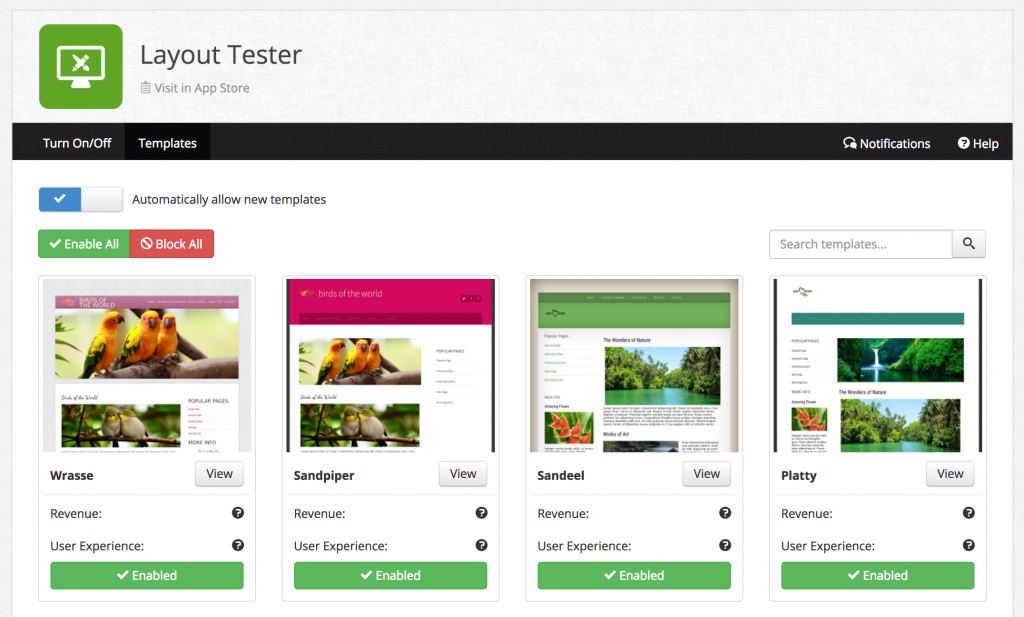
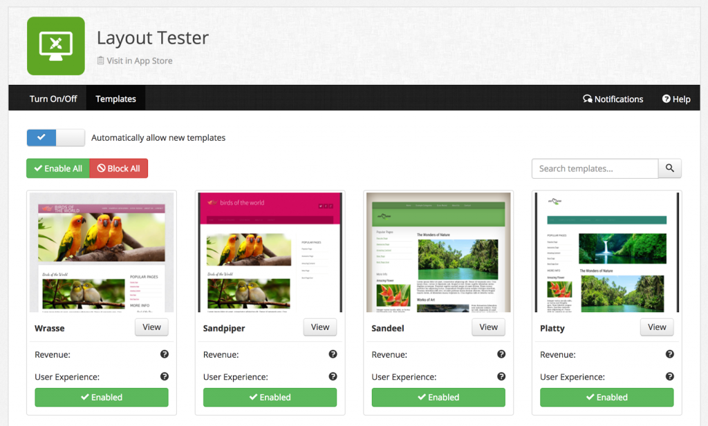
You can see in Figure Two, above, that you can also tune that experience based on whether the user is on a desktop, tablet or mobile device. Not only that, if you see a layout that you just don’t like much or that users complain about, you can click on the “Templates” link and enable or disable specific layouts rather than all en masse:

Another handy tip: If Layout Tester is over the top for your desktop page layout, consider using it for mobile pages only and using Ad Tester for your desktop layout. The best of both worlds without the shock of completely new layouts being sprung on you!
What’s coming next from me…???
Next week we’ll dive into the data science laboratory of Ezoic: Experiments. Meanwhile, please open up a window to your own Ezoic site settings and compare what we’re talking about with what you actually have configured on your site, fixing anything as needed.

